CEWERS
Conflict Early Warning System for Taraba, Benue & Nasarawa State (CEWERS) facilitating response to emergencies.
Government, Emergency
Project Type
Mobile UI UX Design
Project Date & Duration
5 Months
Client
UNDP
Background
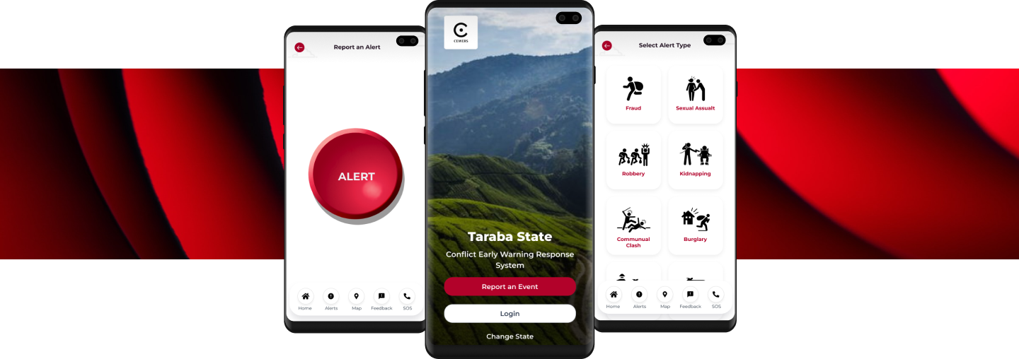
A user-friendly mobile app for conflict-prone regions, allowing easy incident reporting, real-time updates, and connection with authorities, enhancing safety and response efficiency.
My role
User Research, User Personas, User Journey Map, User Flows, Wireframes, UI Design and User Testing
Team Structure
I worked as part of a small team of a UX UI lead, a Mobile Engineer, Full Stack Developer, Project Manager, Product Owner and Stackholders.
The Problem
Indigenes in conflict-prone regions in the Northern part of Nigeria often lack timely access to information and tools to report emergencies and potential conflicts, leaving them vulnerable to danger and hindering the efforts of humanitarian organizations to respond effectively.
The Solution
Develop a user-friendly mobile app that serves as a conflict early warning and emergency reporting system. Users can easily report incidents, access real-time updates, receive alerts, and connect with local authorities and humanitarian organizations.
User Research
Stakeholder Interview
An interview was conducted via Google Meet with key stakeholders situated in the affected states to gain a profound understanding of their needs. The primary objective was to ascertain how the Early Warning System could effectively address their challenges, identify potential pain points, and establish a comprehensive understanding of the platform's user base. Through this session, valuable insights were gathered, needs were identified, and distinct user categories were delineated, contributing significantly to the project's direction and objectives.
Research Methods
We employed a mixed-methods approach, combining quantitative and qualitative research methods, to develop the "Cewer" early warning system. A group interview session was done followed up with a survey.
Research Purpose
The primary objective of this research was to understand the security challenges faced by rural communities in Northern Nigeria due to attacks on farmlands. We aimed to design an early warning system that would facilitate real-time alerts to security agencies during such attacks.
Participants
<span data-metadata=""><span data-buffer="">The study involved 15 participants, comprising local residents, farmers, community leaders, and security personnel in rural areas of Northern Nigeria that had been affected by any of these incidents. These session were organised by the UNDP and local governments.
Some Questions Asked
How frequently have you or your community experienced attacks on farmlands in the past year?
On a scale of 1 to 5, how prepared do you feel your community is to respond to these attacks?
Have you ever reported an attack to local security agencies? (Yes/No)
Can you describe the challenges you face when trying to report or respond to farmland attacks?
What specific information or alerts would be crucial for security agencies to receive in real-time during an attack?
How do you envision the "Cewer" system assisting your community during such incidents?
<span data-metadata="">
Response
68% of participants reported experiencing attacks on farmlands in the past year.
The average preparedness rating was 2.8 out of 5, indicating a need for improved readiness.
42% of respondents had never reported an attack to local security agencies.
Participants described challenges such as lack of communication infrastructure, fear of retribution, and delays in response from security agencies.
Crucial information identified included location, type of attack, and the number of attackers.
The "Cewer" system was seen as a vital tool to facilitate immediate communication with security agencies, potentially reducing response times and enhancing community safety.
The average preparedness rating was 2.8 out of 5, indicating a need for improved readiness.
42% of respondents had never reported an attack to local security agencies.
Participants described challenges such as lack of communication infrastructure, fear of retribution, and delays in response from security agencies.
Crucial information identified included location, type of attack, and the number of attackers.
The "Cewer" system was seen as a vital tool to facilitate immediate communication with security agencies, potentially reducing response times and enhancing community safety.<span data-metadata="">
Type of User
From the interview sessions with the stakeholders, I was able to decide on the type of users for the application. The include the following.

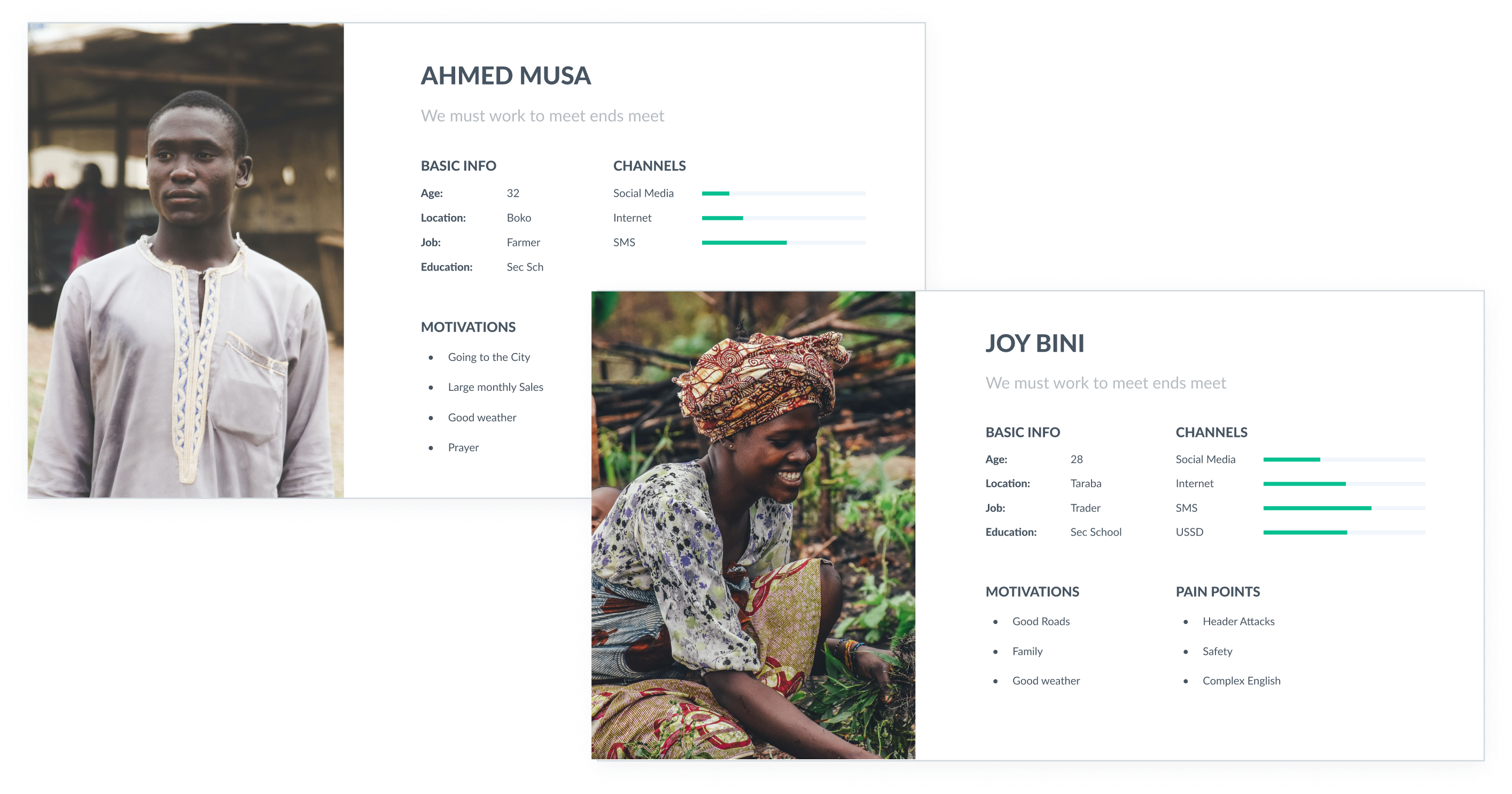
Although the platform had a wide range of users, my focus were more on the end users. Which are the Citizens and monitors. With these I was able to develop User personas, in which we would refer to during the course of this project.
User Persona
While the platform accommodated a diverse user base, my primary focus centered on the end users, specifically, the Citizens and Monitors. This strategic focus enabled the development of detailed user personas that will serve as invaluable references throughout the project's lifecycle.
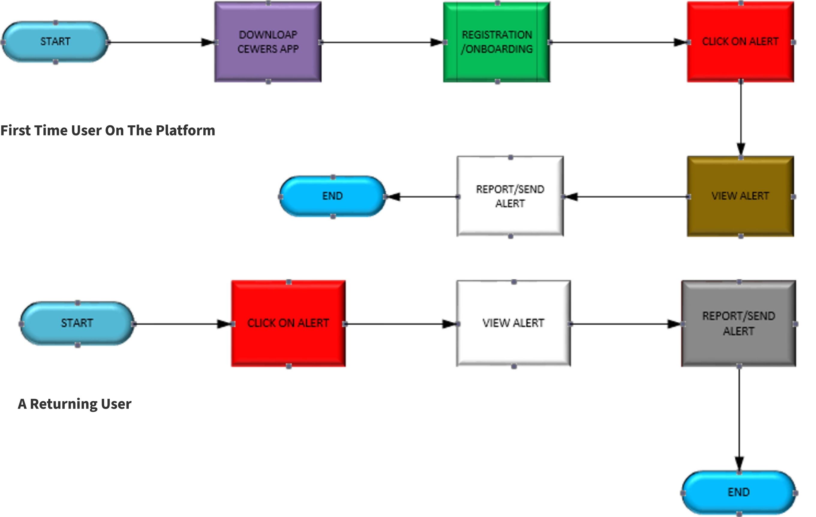
User Journey for Citizens
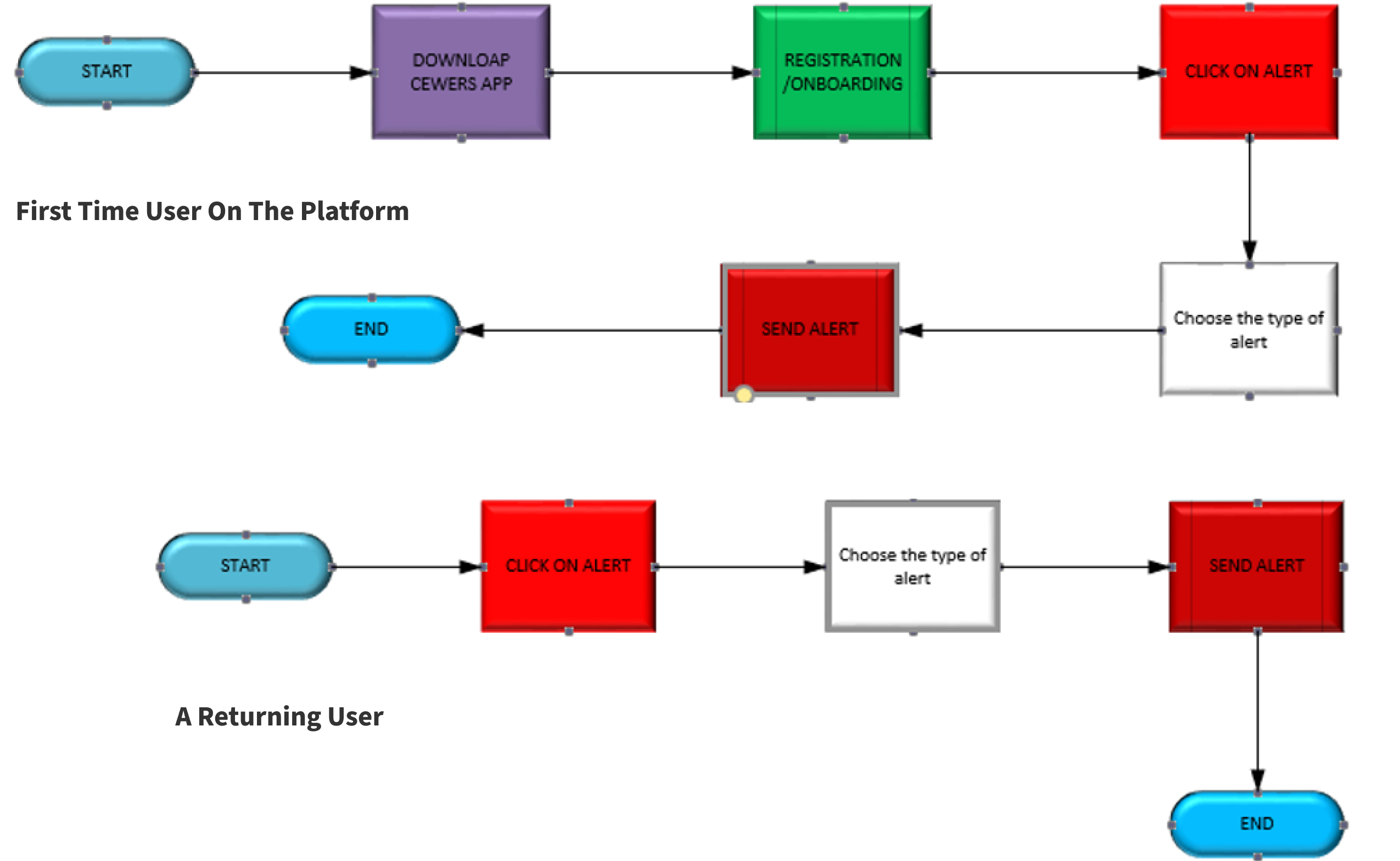
The information gathered, including stakeholder interviews and research findings, played a pivotal role in shaping the user journey for both Citizens and Monitors. It provided critical insights into their needs, pain points, and expectations, allowing for the creation of tailored user journeys that effectively address their unique requirements and experiences within the platform.
User Journey for Monitors
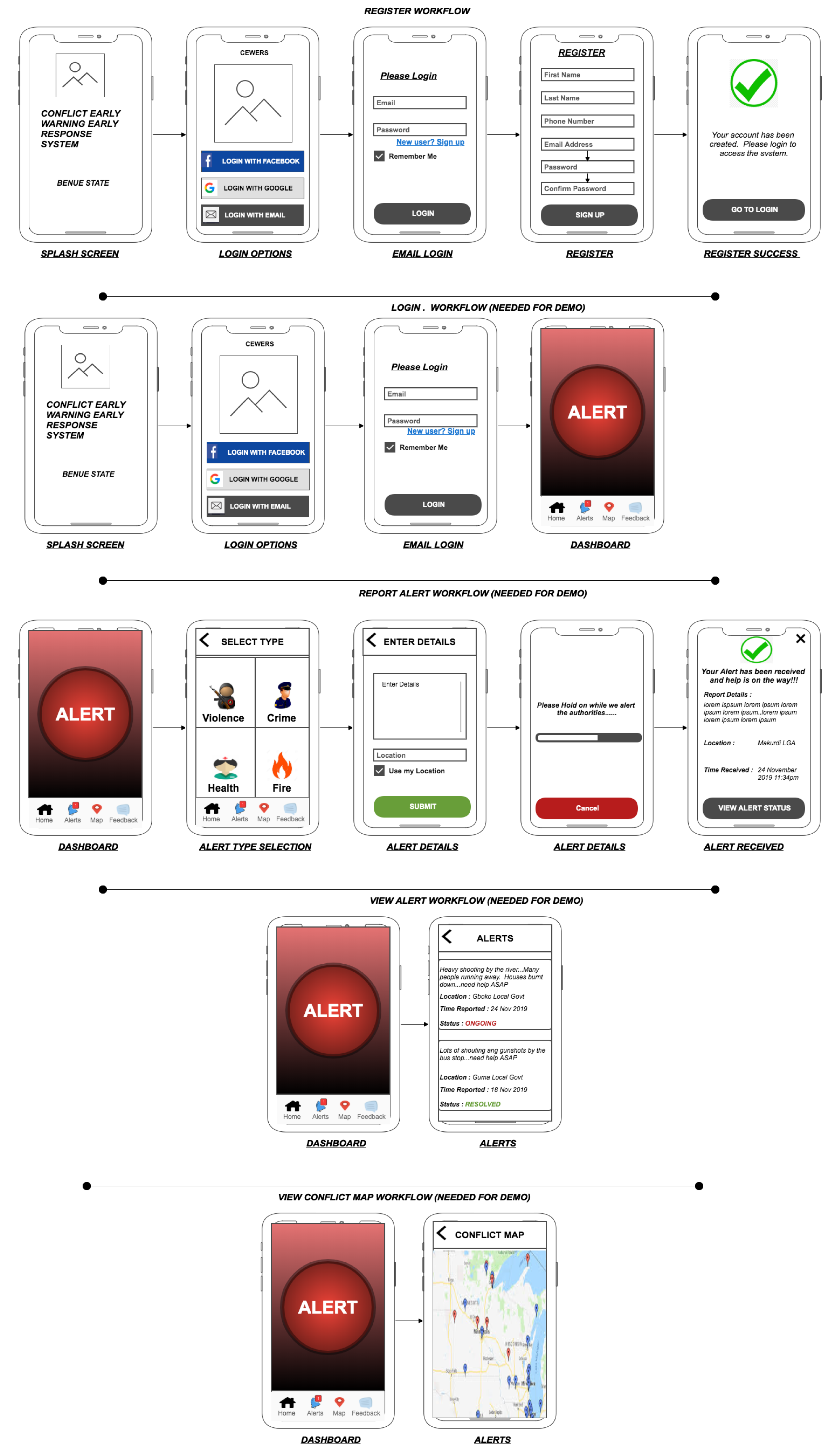
Wireframe
By understanding the specific needs and preferences of both Citizens and Monitors, these wireframes were tailored to ensure that the user interface and functionality met their expectations and facilitated a seamless and user-centric experience.
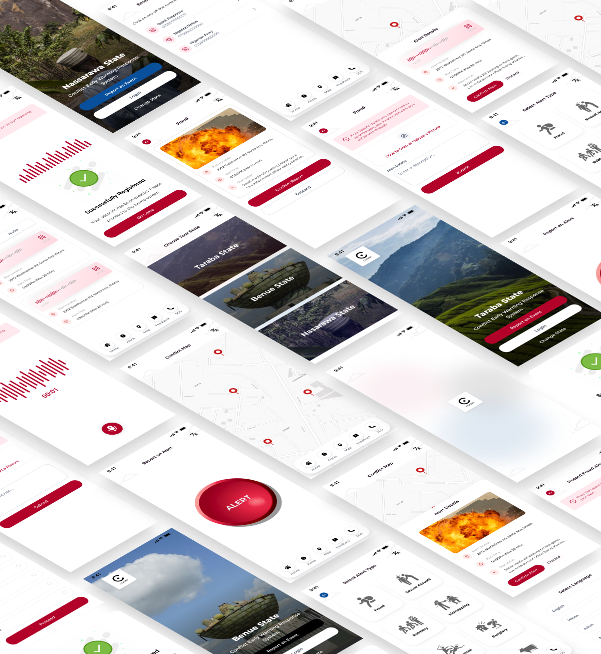
User Interface Design
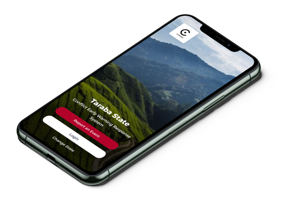
Following stakeholder review and extensive research, design decisions were made to represent each state uniquely with colors and landmarks. Colors like Black, Red, and Blue were chosen to represent Benue, Taraba, and Nasarawa respectively. Original state landmarks were incorporated into the onboarding page.
Additional design choices included using simple Black icons for alerts to accommodate diverse user backgrounds. Multilingual support was introduced to cater to the linguistic diversity within these states. The user experience was streamlined allowing users to skip the login process and minimizing sign-up fields. The application can now send alerts without user login, utilizing GPS for location data, even in situations with no internet connectivity.
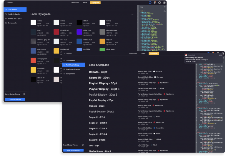
Style guide & Handover
I facilitated a smooth handover of all design assets to the development team, encompassing images, font files, icon fonts, wireframes, and style guide updates. To streamline this process, the Zeplin tool was utilized effectively. Screenshots of the local style guide and assets within Zeplin were provided as a comprehensive reference.
Usability Testing
Objectives
The usability test aimed to evaluate the effectiveness and user-friendliness of the Cewer early warning system in real-world conditions.
Participants
We engaged 12 participants, including local residents, and community leaders from rural areas in Northern Nigeria, who were familiar with the Cewer system.
Test Environment
The test was conducted in a controlled environment that simulated real-world emergency scenarios in rural Northern Nigeria. Participants used mobile devices provided by the team. This test was done with an andriod APK developed to without the end to end back-end functionality.
Task
<span data-metadata=""><span data-metadata=""><span data-buffer="">1. Report Fraud Alert without details: Participants were instructed to use the CEWERS system to initiate and report a Fraud alert without providing an details
1. Report Disaster Alert with details: Participants were instructed to use the CEWERS system to initiate and report a Fraud alert with providing an details.
3. Change Language: Participants had to change the language of the App to their preferred language.
4. Monitors should Confirm and Alert: Monitor users of the App where asked to confirm an alert that had been reported by a regular citizen.
5. Reporting an Alert with and without logging in: Participants were prompted to access emergency instructions for a simulated situation.
6: Locate an alert in the area with the Conflict Map.
Evaluation Criteria
1. Task Success: Measure the participants' success in completing each task. 2. Time on Task: Assess the time taken by participants to complete each task. 3. Error Rate: Record any errors or difficulties encountered during tasks. 4. Satisfaction: Gather user feedback on their overall satisfaction, including ease of use and clarity of instructions.
Findings
1. Task Success: Participants successfully initiated emergency alerts. However, there were some difficulties in reporting specific attack details.
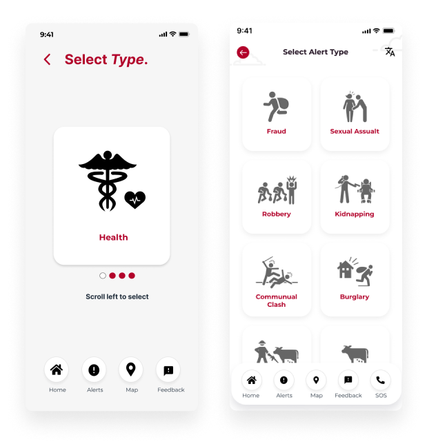
2. Time on Task: Tasks related to alert initiation were completed quickly. However selecting an alert from the Select Alert Screen took longer than usual because the user had to swipe across various alerts.
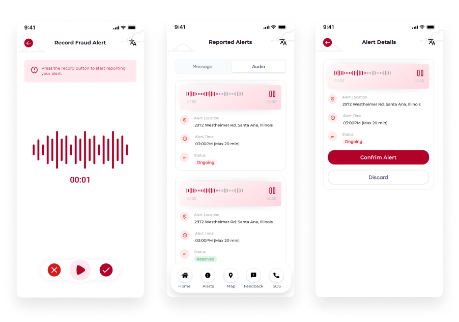
3. Error Rate: Several participants encountered errors when attempting to report attack details, this could be attributed to pressure while simulating a real life scenario.
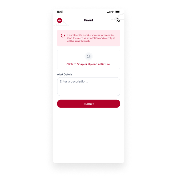
4. Satisfaction: Overall, participants expressed satisfaction with the app's concept and functionality. However, they highlighted the need for clearer instructions.
Impact
The usability test findings had a significant impact on the Conflict early warning system's development:
1. Flow Refinements and Presentation: Based on task difficulties and errors, the Select alert type presentation was changed.
2. Instruction Clarity: User feedback led to the revision of in-app instructions to improve clarity and user guidance. We added noticeable instructions to guide the users
3. Alert Details Difficulties with typing: To solve this problem, we decided to add a recording functionality for users who preferred typing less.
4. User Training: The results highlighted the importance of providing comprehensive user training to ensure effective use during real emergencies. This would be handled after completion of the App. The Team would prepare a standard help documentation and embark on a sensitisation activity around various states.
By addressing these findings, the app was enhanced to better serve its critical purpose of assisting rural communities in Northern Nigeria during emergency situations, ultimately improving their safety and security.
Result & Outcome
The new design received official approval from stakeholders and underwent rigorous usability testing to ensure it met established standards. Additionally, the design was endorsed by the respective State Governments. Post-development, this solution is poised to significantly contribute to peacekeeping initiatives in Northern Nigeria.
While we view this as a crucial initial step, there is substantial room for further expansion and refinement within this project. Continuous data tracking and an in-depth understanding of user responses to our new design will be paramount. Our primary focus will revolve around enhancing the overall design system and exploring different variations to determine the most effective approach for different kinds of users in these communities. Furthermore, the project has the potential to evolve into a comprehensive reporting system, offering administrators a service design portal enriched with AI-driven data and visualizations.
For your reference, please find below the links to access the live applications for both web and mobile platforms.