Omney

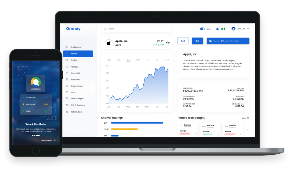
Omney is an software as a service for trading and managing stock portfolio

Financial Technology

Project Type

Web and Mobile UI UX Design

Project Duration

5 Weeks

Client

CSL Stockbrokers

Background

<span data-metadata=""><span data-buffer="">With the looming challenges of trading international stock locally, CSL seeks to develop an international stock trading app for users of all levels, offering a user-centric interface with real-time data, educational resources, and wallet system.

My role

<span data-metadata=""><span data-buffer="">Design Sprint Planning, User Research, User Personas, Competitor Analysis, Mind Maps, Wireframing, UI Design and Prototyping.

Team Structure

<span data-metadata=""><span data-buffer="">I worked as part of a large team as a UX UI lead among a junior UI UX designers, 2 Mobile Engineer, 2 Back end Engineers, 3 Front-end engineers, Project Manager, Product Manager, QA Team, DevOps and Data Analyst

The Problem

Many users in Nigeria face challenges when using international stock trading applications, struggling with complex interfaces, language barriers, and a lack of personalized features, hindering their ability to efficiently navigate global markets and make informed investment decisions.

The Solution

Develop an international stock trading application that prioritizes user experience by offering a streamlined and intuitive interface, multi-language support, region-specific market insights, personalized trading tools, and an inclusive customer support system. This user-centric approach will empower both local and international users to confidently engage in global stock trading, making informed investments with ease and convenience.

Design Sprint

<span data-metadata=""><span data-buffer="">I organised a session to meet all the stakeholders and understand what they’re trying to achieve and any design assumptions they may have. To facilitate the workshop I’ve used Lean Canvas to help us quickly define the current problems, Design goals, and value propositions before getting into research.

Research

<span data-metadata=""><span data-buffer="">In order to meet the challenge of designing and developing a stock trading application that caters to both local and international users, we employed a combination of research methods to ensure we gained a complete understanding of user requirements and preferences during the design sprint.<span data-metadata="">

User Interviews

<span data-metadata=""><span data-metadata=""><span data-buffer="">Research Objective: To gain in-depth qualitative insights into user behaviours and motivations when using stock trading applications. <span data-metadata=""><span data-buffer="">
Why the Method was Chosen: Group Online interviews were chosen for their convenience and the ability to connect with participants, including staff of the CSL group with stock trading knowledge
<span data-metadata=""><span data-buffer="">
<span data-metadata=""><span data-buffer="">Number of Participants: 10 participants, including CSL staff who were actively involved in the design sprint.
<span data-metadata=""><span data-buffer="">
<span data-metadata=""><span data-buffer="">Interview Context: The user interviews were conducted online with participants who already possessed knowledge of stock trading and had experience with similar apps. Their involvement in the design sprint made them ideal candidates to provide valuable insights.

HMW Activity (Mind Maps)

<span data-metadata=""><span data-buffer="">After the user interviews, an "How Might We" (HMW) activity was conducted with stock experts and stakeholders. This collaborative brainstorming session aimed to define, challenges, and generate actionable problem statements with features from insights in the user interview process.

<span data-metadata=""><span data-buffer="">Key Insights:
1. User Pain Points: Users expressed frustration with existing stock trading apps, particularly regarding usability and stability.
2. Efficiency Prioritization: Users emphasized the need for features that would make their trading experience more efficient.
3. Stakeholder Alignment: The HMW activity with stock experts and stakeholders helped align project objectives and clarify the desired outcome. <span data-metadata="">These research activities ensured that the stock trading app design was driven by user insights, industry knowledge, and clear project objectives, ultimately contributing to a successful and user-focused product.

User Personas

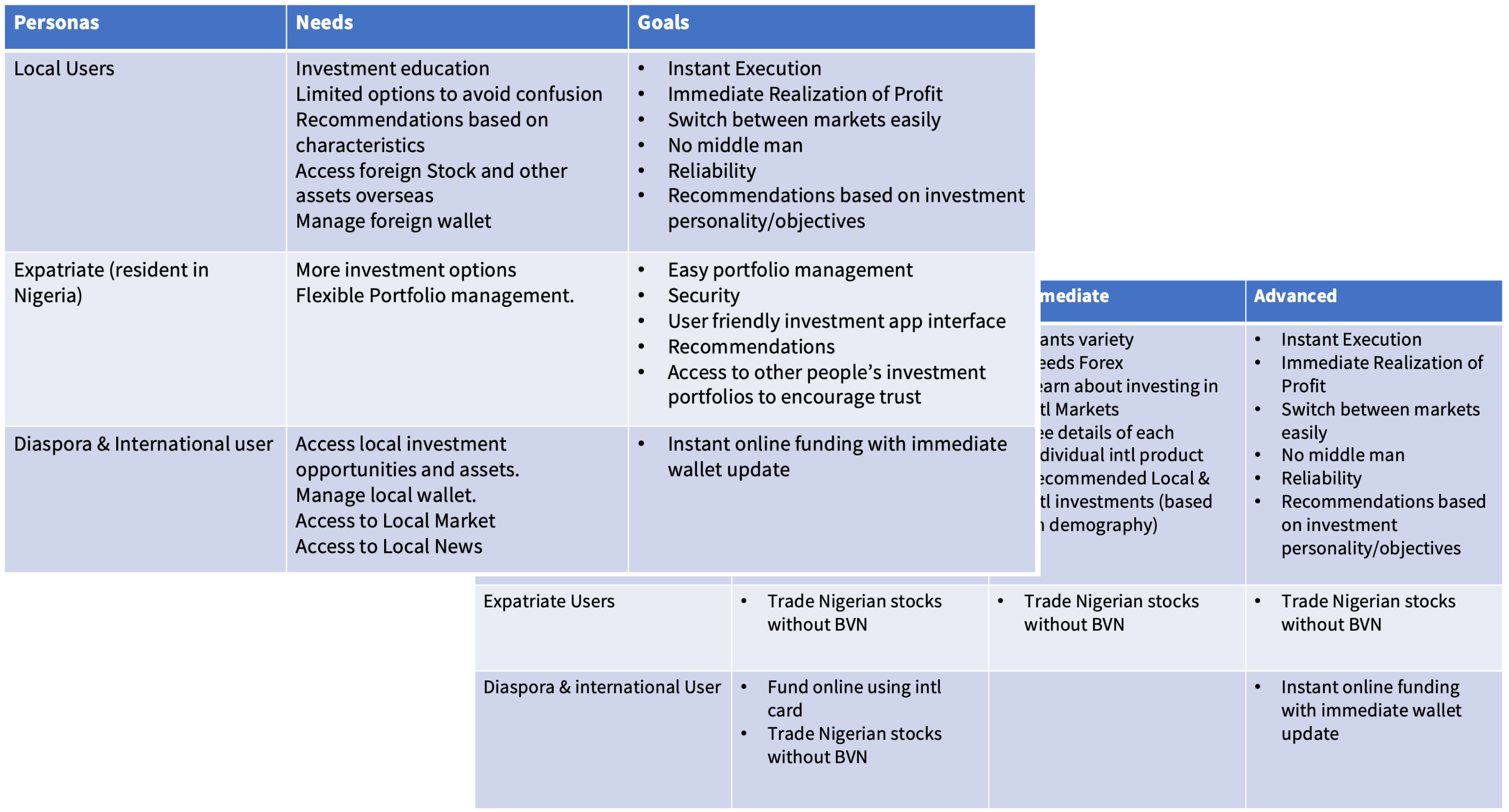
<span data-metadata=""><span data-buffer="">During the Sprint planning, it was my responsibility to champion users personas, in collaboration with the Product manager and the stakeholder. This Persona properly highlights the users from the CSL User Research and Interview, their needs and goals which helped to develop the key features for this application that solved the problem.<span data-metadata="">

Market Research

<span data-metadata=""><span data-buffer="">Research Objective: To identify the current market trends, competitor landscape, and potential gaps in the stock trading application market, both locally and internationally.

<span data-metadata=""><span data-buffer="">Why the Method was Chosen: Market research was essential to understand the broader context in which our application would operate and to identify opportunities for differentiation.

<span data-metadata=""><span data-buffer="">Data Collected: Competitor features, market share, and user reviews.
<span data-metadata=""><span data-buffer="">
Insights: Qualitative insights included understanding user sentiment toward existing applications. Quantitative insights included market size and competitor market share.

<span data-metadata=""><span data-buffer="">Influence on Design: Market research informed our decision to prioritize features that were lacking in competitor applications and to focus on user experience as a key differentiator.

User flow

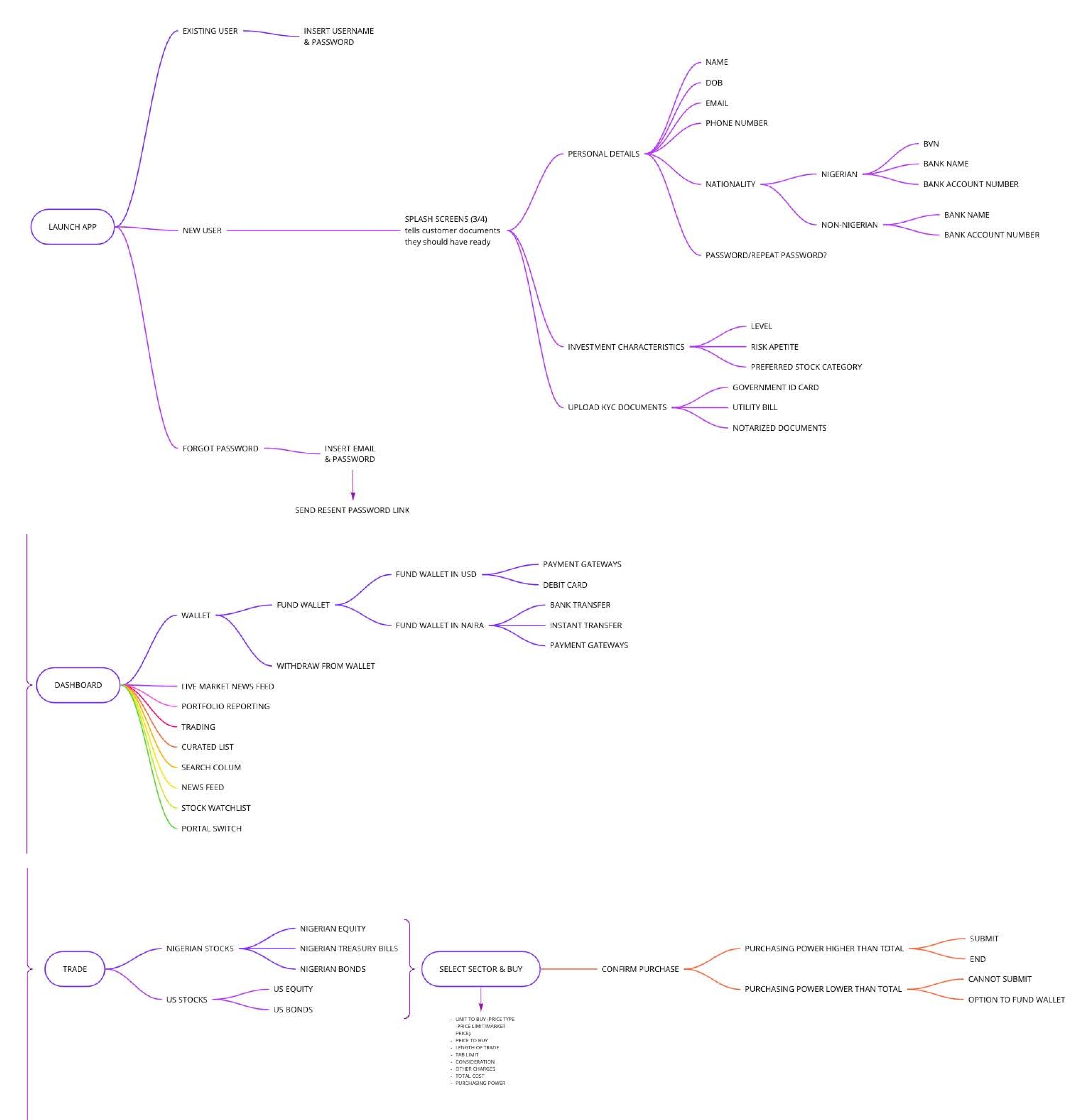
As part of my responsibility after detailed discussions I championed the users flow map in collaboration with other participants in the Design Sprint process, putting every feature of the application into consideration. This will help to fully flesh out the design of the platform. This activity was done using Miro.

Mobile Wireframe

Based on the feedback and personal insights I learned from the sketching phase, I began to design my first wireframes using Figma. I made sure to prioritise the features that would best address the needs of the users throughout the website. I also decided to start the design for the mobile application for easy replication on web and a good design principle which say mobile first. See wireframes below.

Web Wireframe

After designing of the Mobile wireframes I proceeded to the Web Wireframes

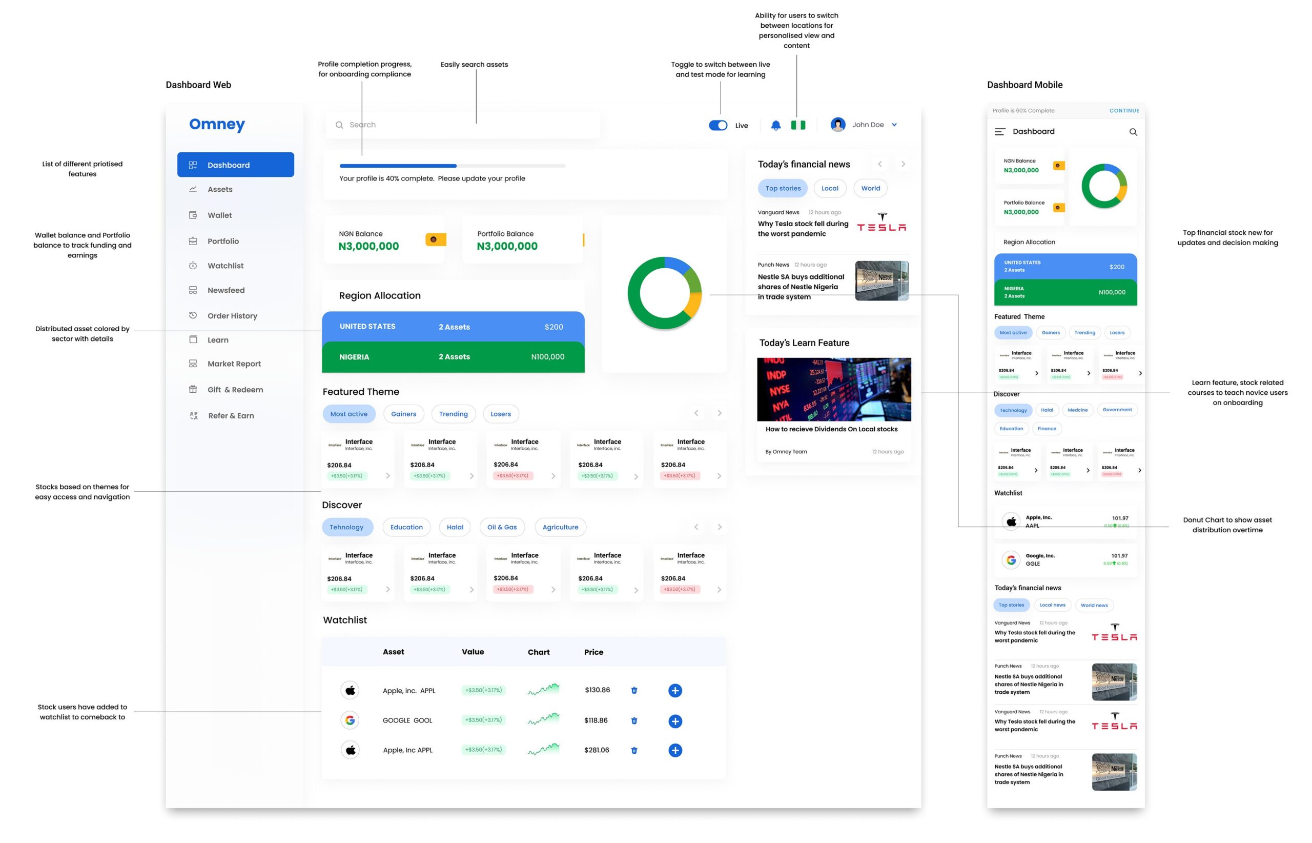
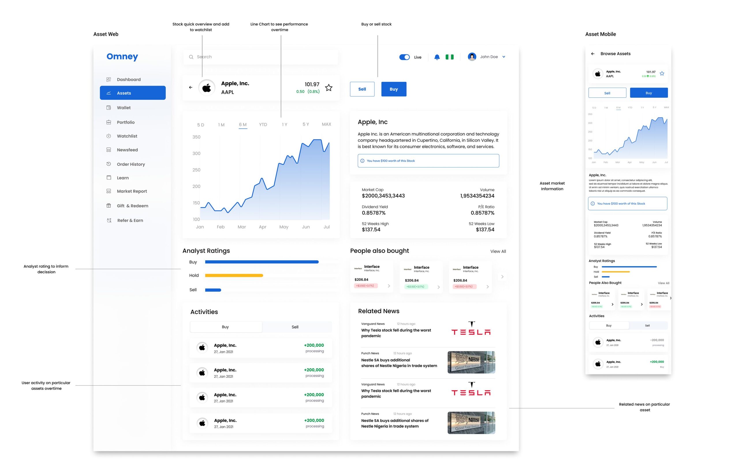
Final Mobile Screens

Web Screens

Mobile Prototype

Result & Outcome

The Design was signed off by the Stakeholders, usability test was done to ensure that the designs meet standards. The design was also prototyped using Figma for the Team to get a full understand on how the application works. As the development was done using Agile methods changes and Tests were re-occuring as the Team were development to achieve a suitable MVP. See Below Links to the final prototype on Figma.