Qore
Qore is a Financial Technology focused on cloud-native Core Banking and other Banking
Finance
Project Type
Web and Mobile App Design
Project Duration
6 Weeks
Client
Qore Technologies
Background
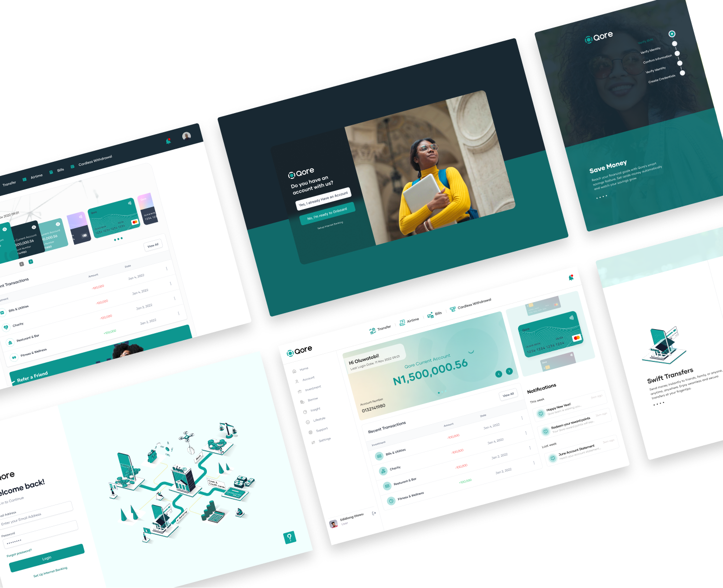
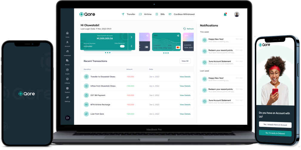
Designing a user-focused internet and mobile banking solution, featuring an intuitive interface, streamlined transfers, bill payment, personalized finance tracking, and lifestyle features.
My role
User Research, User Personas, User Journey Map, User Flows, Wireframe, UI Design and User Testing
Team Structure
An Independent Product Designer amongst a Lead Product Designer, Project Manager, Product Manager, 2 Front-End Engineers and 2 Back End Engineers.
The Problem
Many users struggle with managing their finances efficiently and securely, facing challenges in conducting transfers, paying bills, tracking expenses, and accessing lifestyle features through existing internet and mobile banking solutions that are often complex, lack user-friendly interfaces, and may not cater to their diverse financial needs.
The Solution
Design a comprehensive internet and mobile banking solution that prioritizes user experience by offering an intuitive and visually pleasing interface, streamlined transfer processes, automated bill payments, personalized financial tracking tools, and a range of lifestyle features such as budgeting, investment options, and rewards programs.
User Research
Research Findings
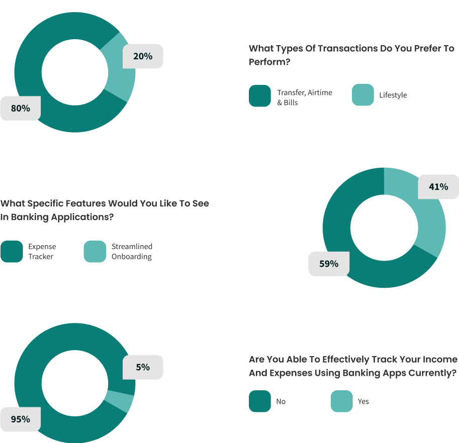
The majority of participants used banking web applications regularly.
Many users expressed dissatisfaction with the complexity and cluttered interfaces of existing app.
Security concerns were prevalent, with participants suggesting the need for enhanced security measures.
Many users also suggested a streamlined and simple onboarding process on the App.
Users had varied methods for managing their budgets, indicating the need for personalized financial tracking tools.
Desired features included simplified, engaging and current interface standard, robust budgeting tools, and secure and user-friendly transfer processes.
User Personas
Utilizing the gathered data from our target audience, I diligently crafted user personas to gain profound insights into their core requirements and challenges, a crucial step in devising tailor-made design solutions that enhance the user experience.
User Persona 1

- Age: 41
- Gender: Male
- Status: Married
- Occupation: Marketing
- Location: Lagos, Nigeria
Lanre Robert
- About
- <span data-metadata=""><span data-buffer="">Jane is Marketing Manager. He lives on fixed income. He prefers to pay his bills, track expenses and plan for the future for his kids.
- Goals
- A user-friendly online platform that provide real time insights into his financials.
- Quick way to transfer money.
- Flexible overdraft options to manage his cash flow effectively.
- Accuracy to have seamless transitions without errors in the withdrawal amount.
- Frustration
- <span data-metadata=""><span data-buffer="">Manual tracking of expenses
- Has not been able to perform all financial activities in one app.
- I experienced ATM malfunctions and glitches which is inconvenient.
User Journey Map
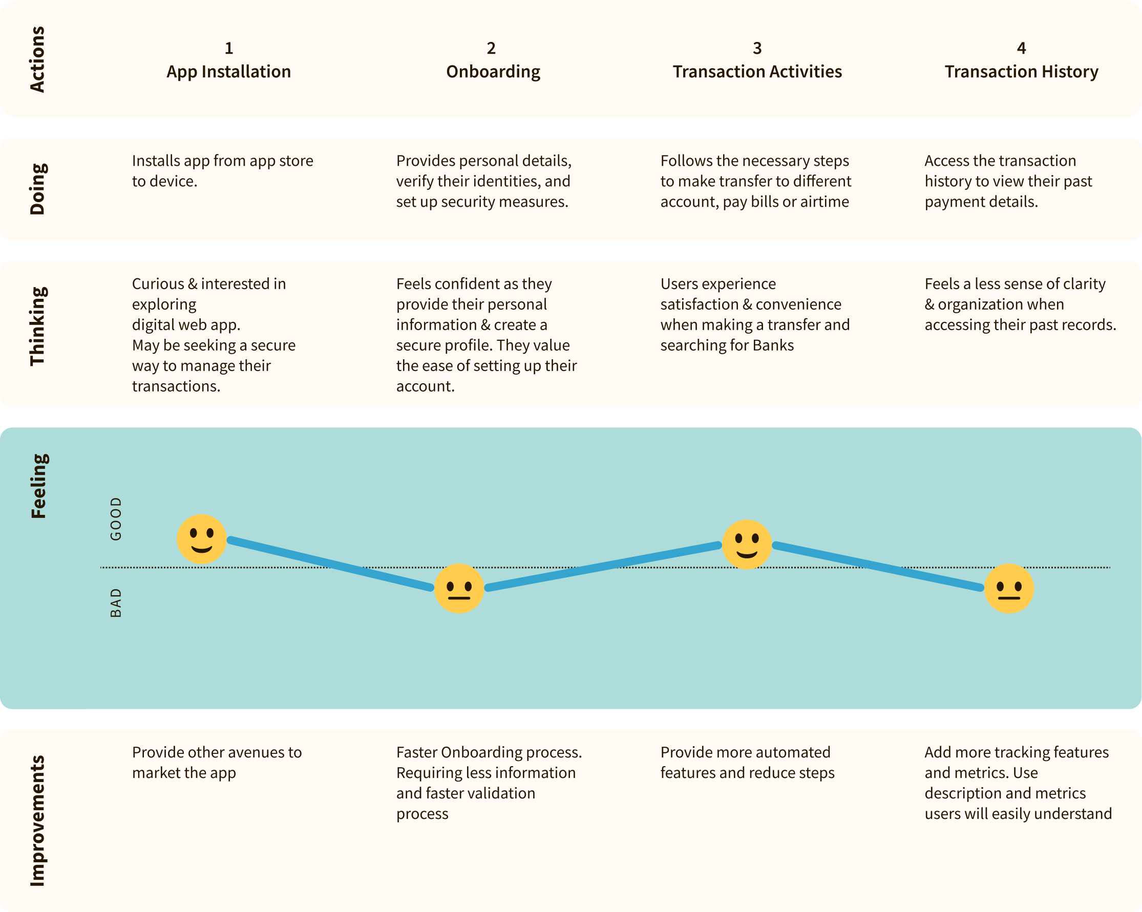
We crafted a user journey map to visually outline the entire user experience, enabling us to pinpoint pain points, opportunities for improvement, and a holistic view of the user’s interaction with the app.
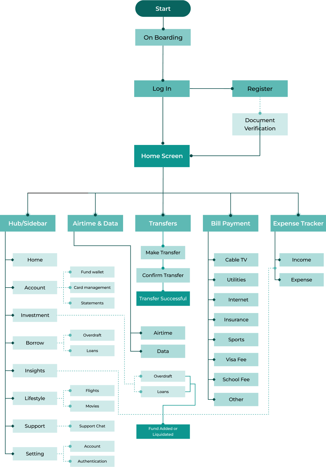
User Flow Map
Wireframes
My approach to wireframing was vital in our project’s early stages. It enabled us to meticulously strategize and converse about the digital product’s structure and functionality. Through wireframes, we mapped out the blueprint of our vision, ensuring that each element would find its perfect place in the final design.
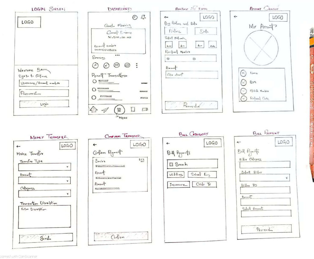
Low Fidelity Wireframe
We chose to start with low-fidelity sketches to rapidly explore design concepts, focus on structural considerations, and facilitate efficient collaboration and user feedback in the early stages of the project.
Design System
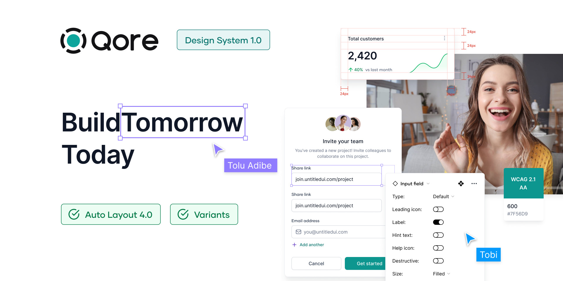
We used the robust Qore design system to ensure consistency, efficiency, scalability, and a strong brand identity.
Stakeholder Validation
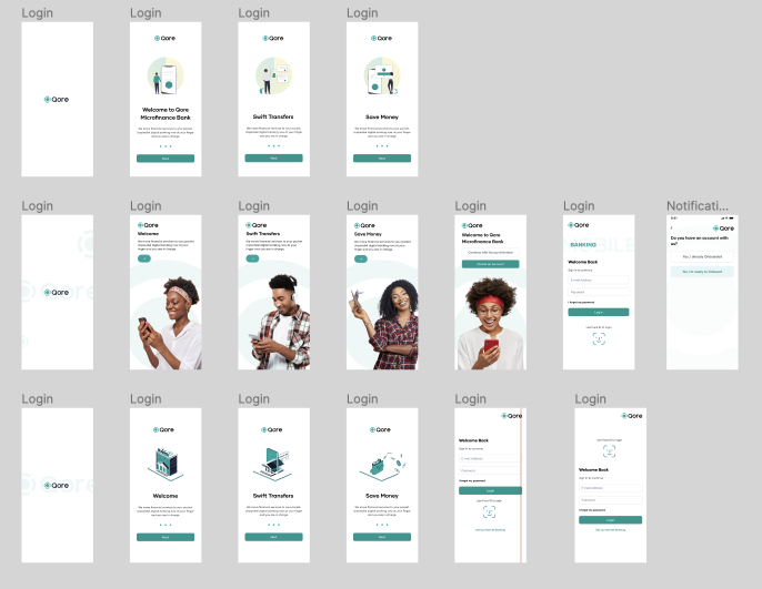
Stakeholder & Expert validation ensured that user experiences aligned with diverse user preferences and security needs, ultimately enhancing user adoption, trust, and overall success of the application. This was usually done in frequent review sprint meetings.
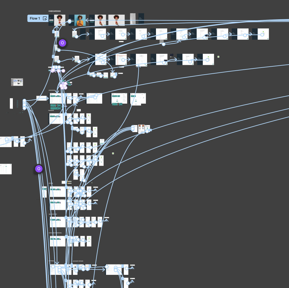
Prototyping
Prototyping allowed for early visualization and testing of design concepts, ensuring user-friendly features. It saved time and resources by facilitating the usability testing where usability issues where identified improving the application’s functionality before full development,
User Validation
Our team prioritized usability testing as a pivotal phase in crafting the QORE web app’s success. We initiated this process by inviting actual users to engage with the application, perform specific tasks, and provide feedback. The primary objectives were to evaluate the app’s user-friendliness, pinpoint any pain points, and gather insights for refinement.
During the initial testing phase, we uncovered several areas that required attention, such as navigation challenges and interface ambiguities. These findings were meticulously documented, and we subsequently embarked on a journey of implementation to address these issues effectively.
Issues and Results
Streamlined Navigation
One of the major challenges was optimizing the app’s navigation to make it more intuitive. By revisiting the information architecture and redesigning key pathways, we achieved a streamlined navigation system that users found much easier to follow.
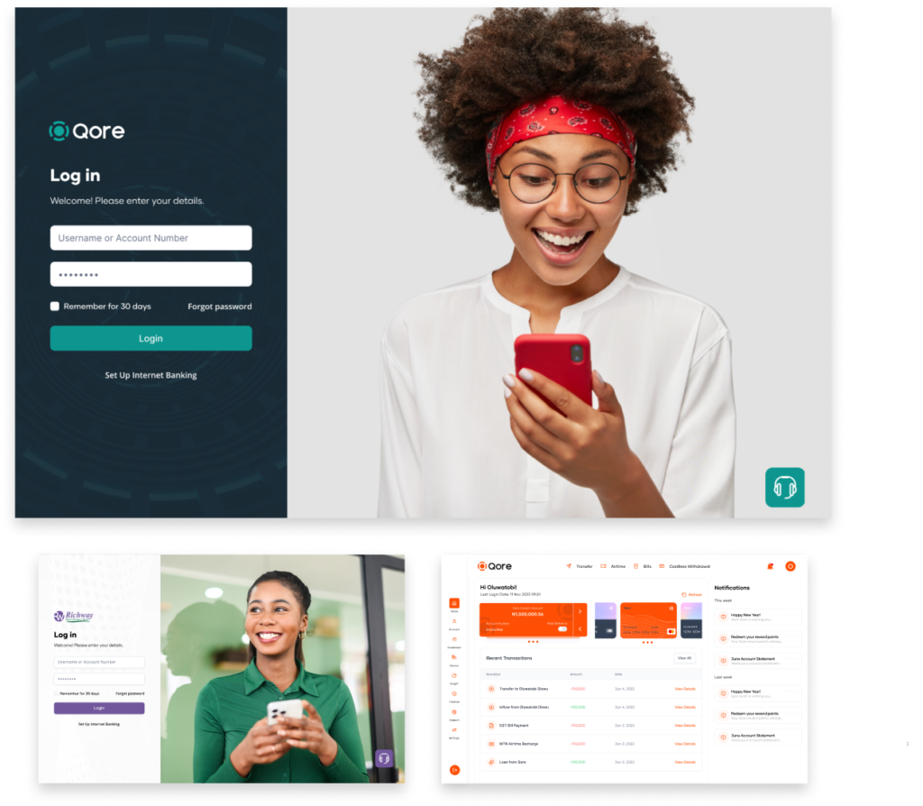
Monochrome Colours
For a range of different MFBs going to use the App, the use of multiple colours will definitely cause issues in the future. We then decided to go with a monochrome approach for colour to enable easy acceptance across MFBs
Card Management
User found it difficult to locate the Card Management Module of the app during the testing. The team decided to make changes by adding cards to the sidebar menu items
Overcoming Challenges
Initial Resistance to Change
Some team members initially hesitated to accept user feedback and make significant design changes. To overcome this challenge, we organized workshops to showcase the value of user-centric design and its impact on the product’s success.
Resource Constraint
Addressing usability challenges required additional time and resources. We worked closely with project stakeholders to reallocate resources and secure the necessary support for these crucial enhancements.
<span data-metadata=""><span data-buffer="">Balancing Feedback
The diverse range of user feedback sometimes posed a challenge in determining which changes to prioritize. To address this, we employed a systematic approach, categorizing feedback based on impact and feasibility, enabling us to make informed decisions.
Hand-Off & Support
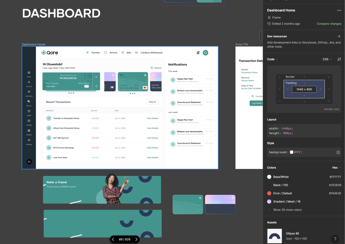
Handoff and design support ensured a smooth transition from design to development, preserving the intended user experience and maintaining design consistency. This collaboration facilitated efficient implementation, reduced errors, and enhanced the overall quality of the internet and mobile banking application.
Conclusion: Transforming Microfinance in Africa
Our internet and mobile banking app’s success in 500+ Microfinance Banks across Africa, with an annual transaction value exceeding $5 billion, underscores its transformative power. Continued engagement with new clients affirms its potential for financial inclusion. As we move forward, our commitment to innovation remains unwavering, promising even greater impact on Africa’s financial landscape.
Future Works: Expanding the Horizons
Our journey doesn’t end here; we’re embracing the future with a clear vision. We’re committed to extending our application’s capabilities, and our focus is on providing an admin addon. This enhancement will empower Microfinance Banks to customize their app experience, offering tailored branding, feed management, and download options.
B2B customers will have the flexibility to set their colors, images, choose between different themes and launch the mobile and web app with a single click. Furthermore, we’re working on delivering an off-the-shelf web app for seamless integration into various business environments. The horizon is boundless, and our commitment to innovation continues.
